About the Company
Rate Retriever is a fast and easy-to-use insurance comparison platform. Rate Retriever aims to create the best possible experience for people who are shopping for a new insurance policy so they can get the coverage they need at a price they can afford. Rate Retriever estimates what each user will pay at the top insurance companies near them, allowing insurance shoppers to compare a personalized list of companies without worrying about spam.
The Challenge
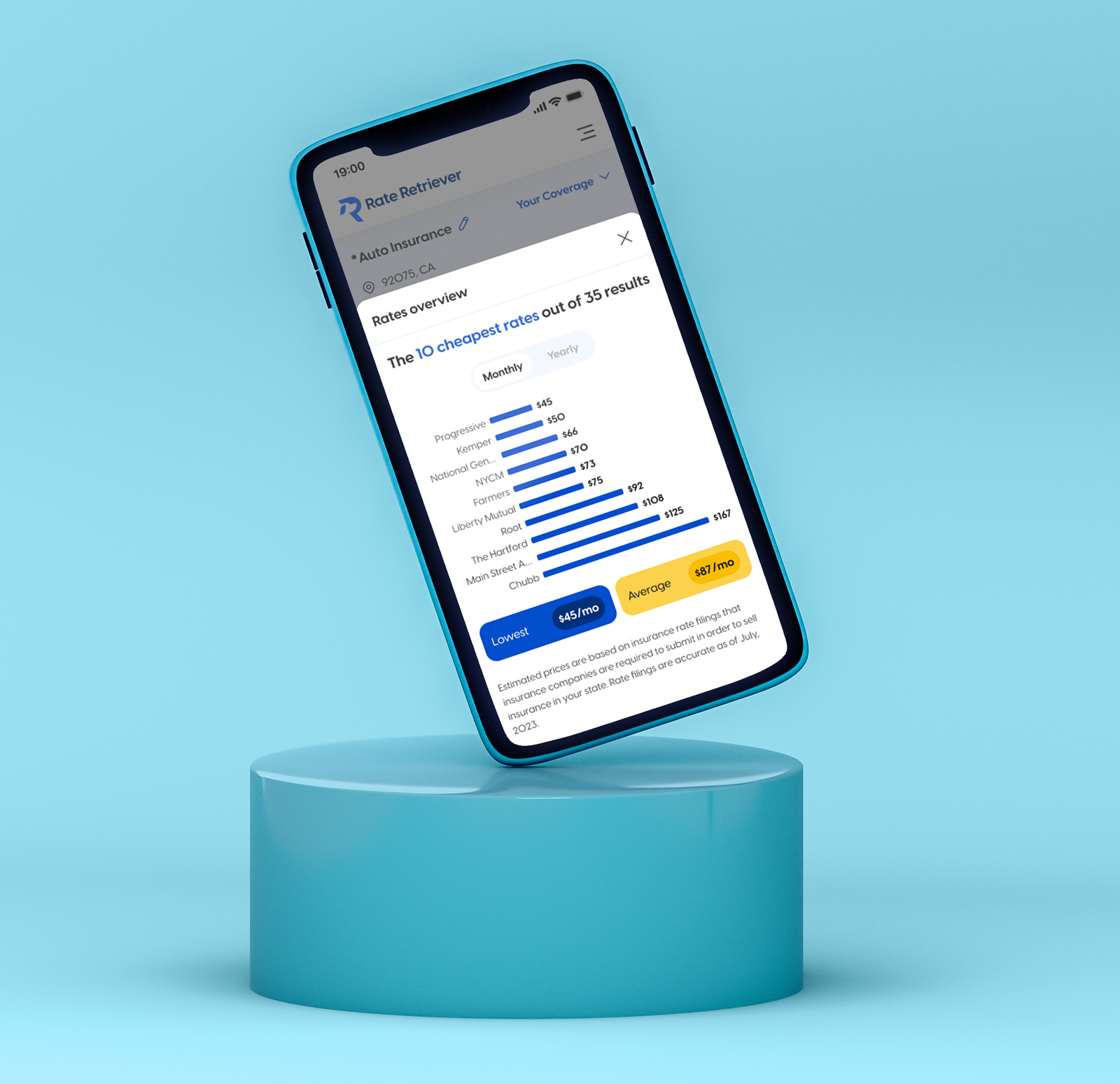
Rate Retriever’s platform was already in great shape when Asymm got involved, but the front-end of the platform needed refining throughout several key user-experience processes. Rate Retriever’s platform facilitates the comparison of insurance rates across a wide range of carriers for home, auto, and bundled coverages. The challenge in designing a platform with this type of function and capability is communicating rates efficiently to the user and giving them benchmark data to measure the cost of the rate they have received based on standard policy limits and average policy premiums. Another large challenge of this project was refining and restyling the intake flow in which a customer provides their personal information in order to receive a rate that reflects the coverage they are shopping for.
Home Page Redesign
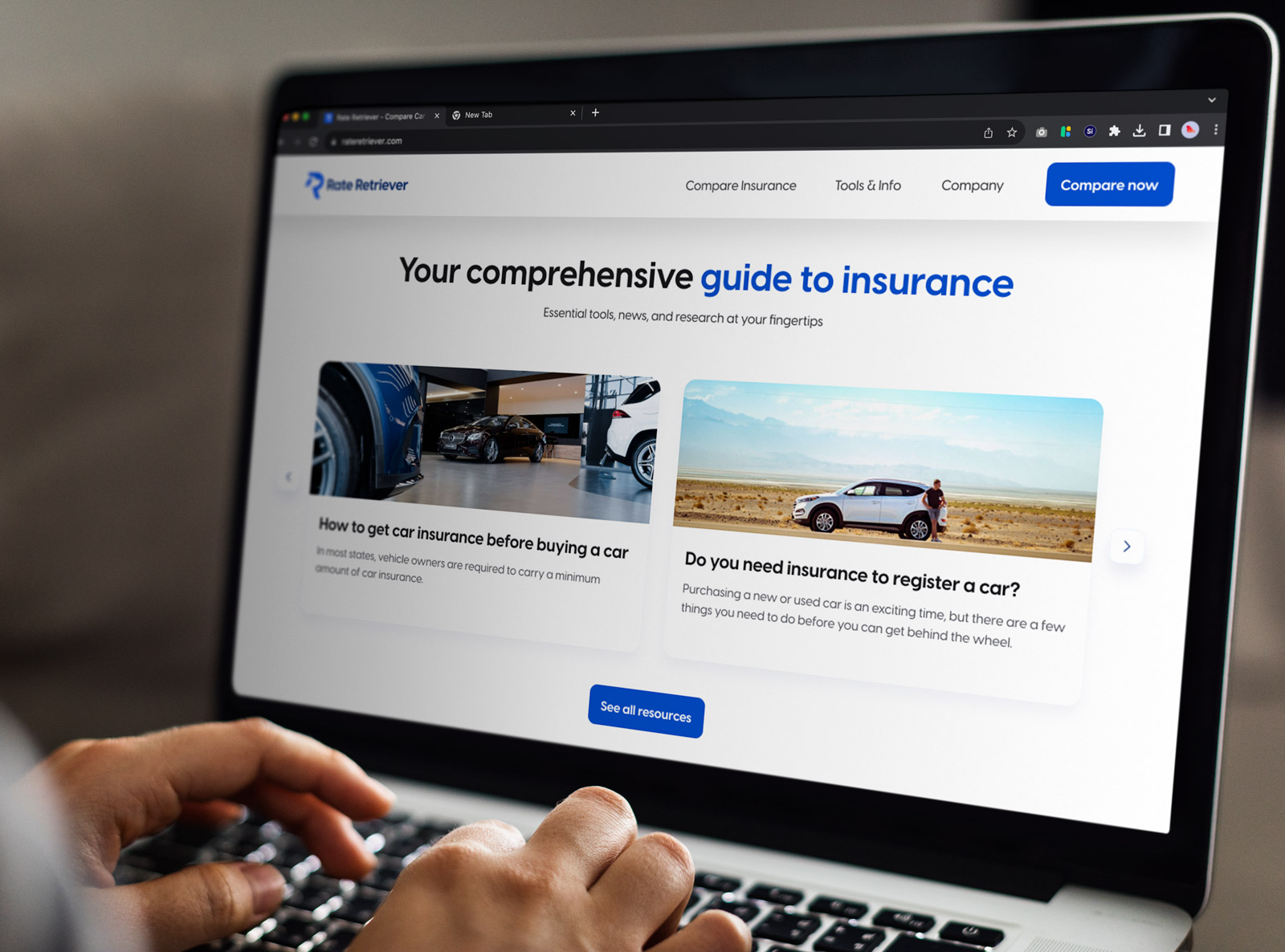
The home page redesign process contained creating modals, banners, animated videos, cards, and more - with the main goal of the home page to facilitate the start of the user journey into finding a new insurance provider for their desired home, auto, or bundled coverage.
Application Flow Redesign
The Profile building process went through a comprehensive UI redesign process as well. While the other aspects of this project also contained a significant UX responsibility, this section in particular, because of the required questions restraint, was mostly a UI exercise that resulted in a multi-step process logically broken down into sections the user could complete and fill in with ease. Depending on the coverages a user needs, the questions change and reflect the required fields for the rating system while using the same design system elements making this a straightforward and intuitive process for the user to complete in order to obtain results.
Results Page Redesign
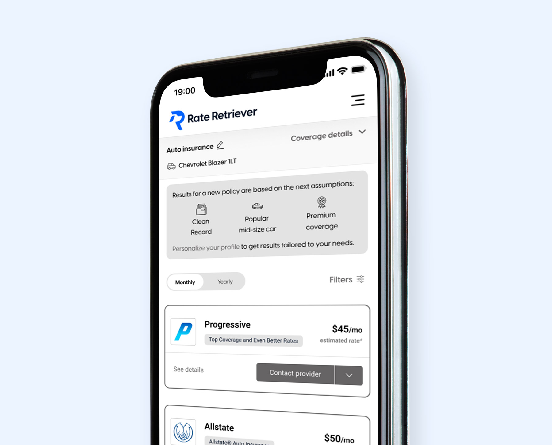
The results page went through a comprehensive redesign that now features simple, legible, and elegant tiles that showcase the different rate estimates for individual carriers. The user is able to scroll down on the results page to view as many carriers as service their specific coverage, while also being able to sort and filter through the results. Each individual company tile has either one or many contact methods in which the user can obtain an actual quote from the carrier directly to facilitate a purchase process. The results page also includes a sidebar where the user can view a condensed summary of their personalized coverage types and other key insights into quote information. This feature aims to assist users in making informed decisions about a potential new carrier based on their individualized results.
Technologies

Figma

After Effects
The Solutions
Our work with Rate Retriever culminated into a comprehensive redesigned UI/UX for their web-based insurance comparison platform. Asymm took a mobile-first approach to redesigning this web based application in order to make it feel like an ios-app meanwhile users do access it through a browser application on their mobile device. Rate Retriever sees a high proportion of mobile traffic on their platforms which influenced the decision to drive the design of this platform to be mobile first. The designs were created in figma and the project deliverables consisted of:
Design system component improvements
Medium fidelity wireframes
High fidelity mockups
Digital Prototypes
Exported assets in usable web formats
Our Impact
Our impact derives from conversion and usability metrics that will be accumulated by Rate Retriever over the coming months. Rate Retriever is growing their inbound traffic and has confidence that this new UI/UX will strengthen their product market fit and encourage additional carrier participation.


