About the Company
North American Production Sharing (NAPS) is a leading manufacturing outsourcing company that provides specialized administrative and compliance management services to companies manufacturing in Mexico. With a strong presence across Mexico, including locations in Baja California, Guanajuato, Nuevo León, and beyond, NAPS has established itself as a trusted partner and expert in the field of Mexico manufacturing.
The Challenge
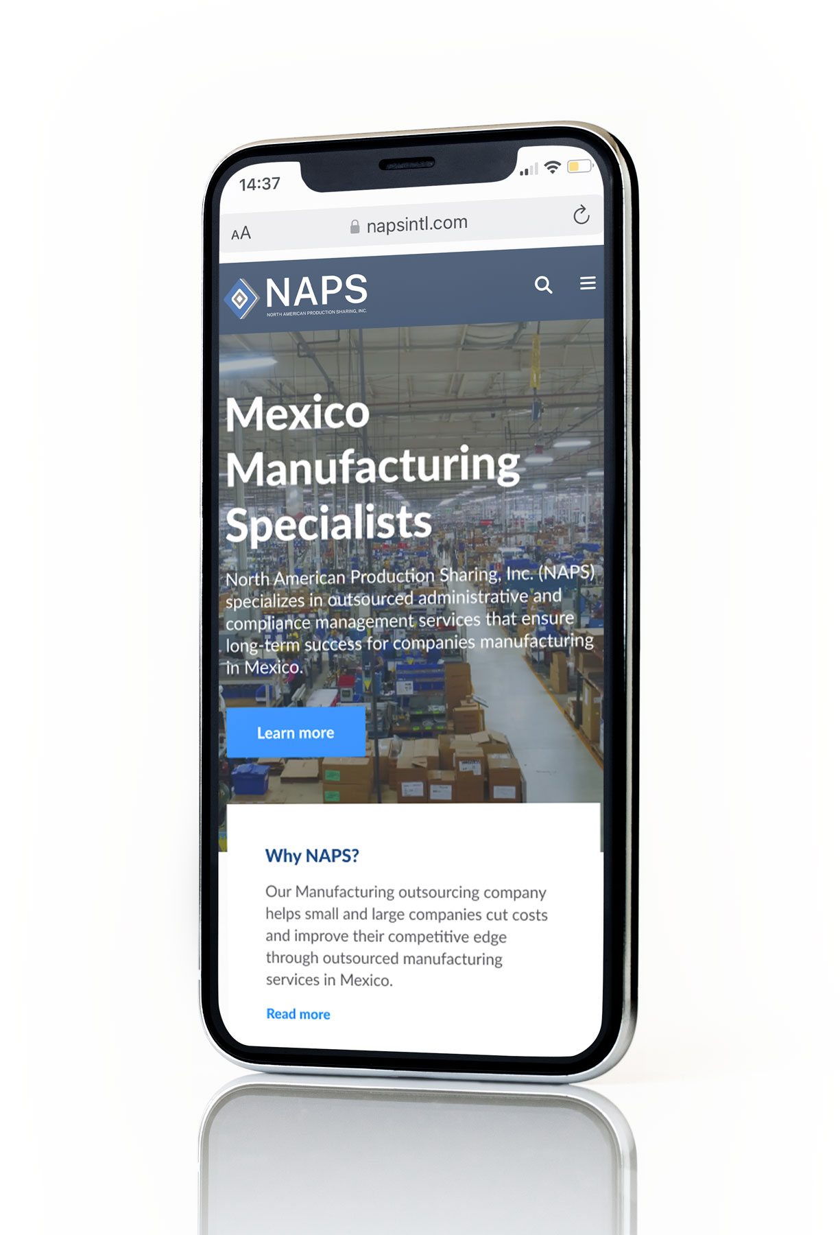
NAPS aimed to enhance their website's visual messaging and improve brand messaging that potential customers perceive. While the website contained all the necessary information about their services, locations, and contact details, it lacked visual consistency, making it difficult for users to navigate, resulting in short visits on the site and reduced conversions.
To address these issues, we conducted a branding revision of NAPS' logo and established a customized design system. The objective was to simplify navigation, provide a solid identity and personality through their digital communication, ensure consistency within information hierarchy, and improve the user flows on all devices including tablets and mobile devices - all without affecting the website's SEO positioning.
The Process
01
Thoroughly analyze and gain a comprehensive understanding of the website architecture, design, and structure of information contained on the website in order to develop effective optimization strategies.
02
Create the basis of the design system, which involved redesigning the logo, selecting appropriate colors and fonts, and creating basic components such as the menu, footer, and other key elements.
03
Prioritize written SEO optimized content and integrate multimedia modules and visual ques to facilitate the elegant display of information and simplify the flow and retention of users.
04
Create and apply complex components such as maps, tabs, and complex cards, as well as micro-interactions and animations that reinforce visual appeal.

The Solution
Our goal was to provide a new visual identity for NAPS while preserving its existing SEO positioning. By renewing the logo and creating a design system tailored to the needs of one of the leading manufacturing companies in Mexico, we were able to enhance NAPS' brand identity. The final product is a responsive, custom designed website that adapts to different device sizes and improving user navigation and retention. To achieve this, we used style guides to maintain consistency and scalability of the design components that ensuring a cohesive user experience across the website.
Technologies

Figma

Protopie

FigJam
Our Impact
The new NAPS website boasts an improved UI and readability, resulting in an enhanced user experience. The website's sleek visual aesthetic has contributed to an increased viewer retention rate and a more pleasant browsing experience.


